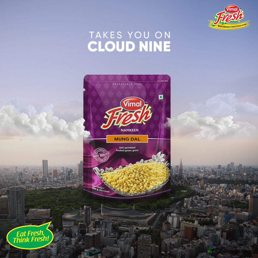
Ideation: Positioned the product above the city to symbolize elevated taste and experience. Why it works: The surreal composition creates a premium perception and strong visual impact.
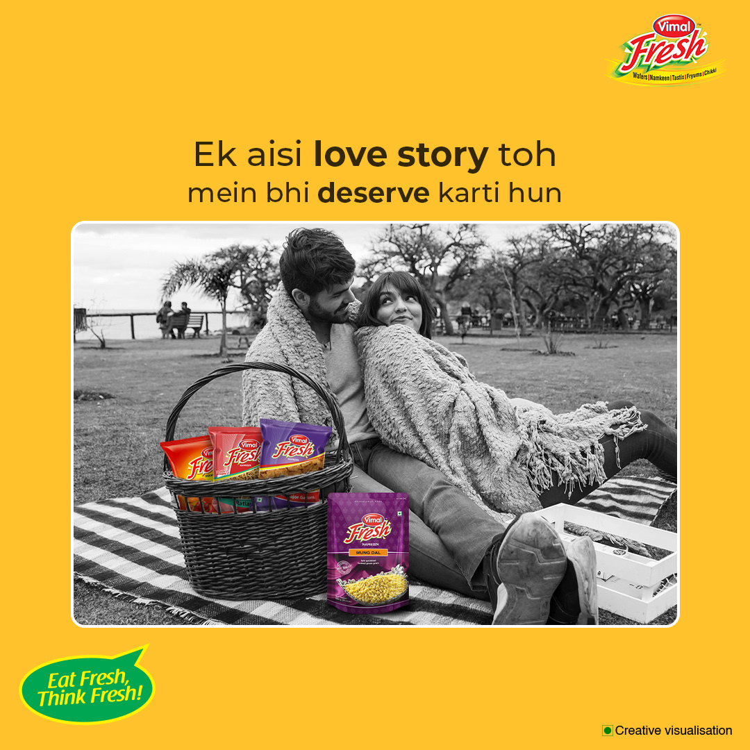
Ideation: Used a relatable romantic moment to emotionally connect with the audience. Why it works: Blending lifestyle with product makes the brand feel natural and memorable.
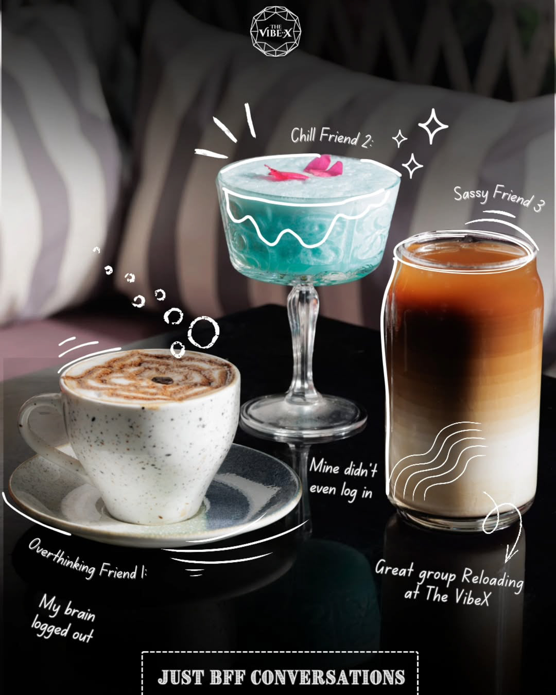
Ideation: Represented drinks as personalities to create a fun, relatable narrative. Why it works: The playful approach increases engagement and makes the content shareable.
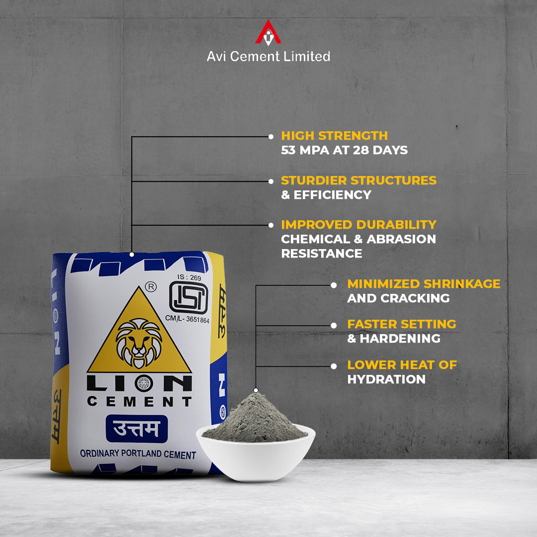
Ideation: Focused on clarity by visually breaking down product features and benefits. Why it works: The clean layout ensures easy understanding and builds trust in the product.
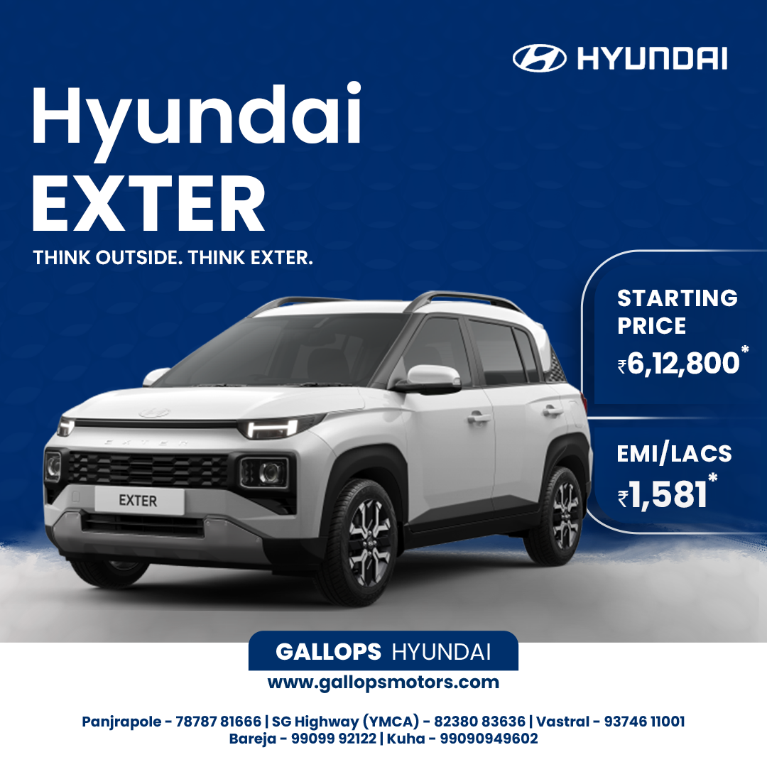
Ideation: Combined strong typography with a clean layout to highlight value and features. Why it works: The structured design makes key information instantly visible and impactful.
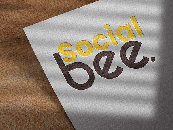
Ideation: Created a minimal yet textured identity to reflect creativity and modern branding. Why it works: The simplicity enhances versatility while maintaining a premium feel.
Ideation: Designed a clean, modern logo adaptable to real-world applications. Why it works: The mockup showcases practicality and strengthens brand credibility.
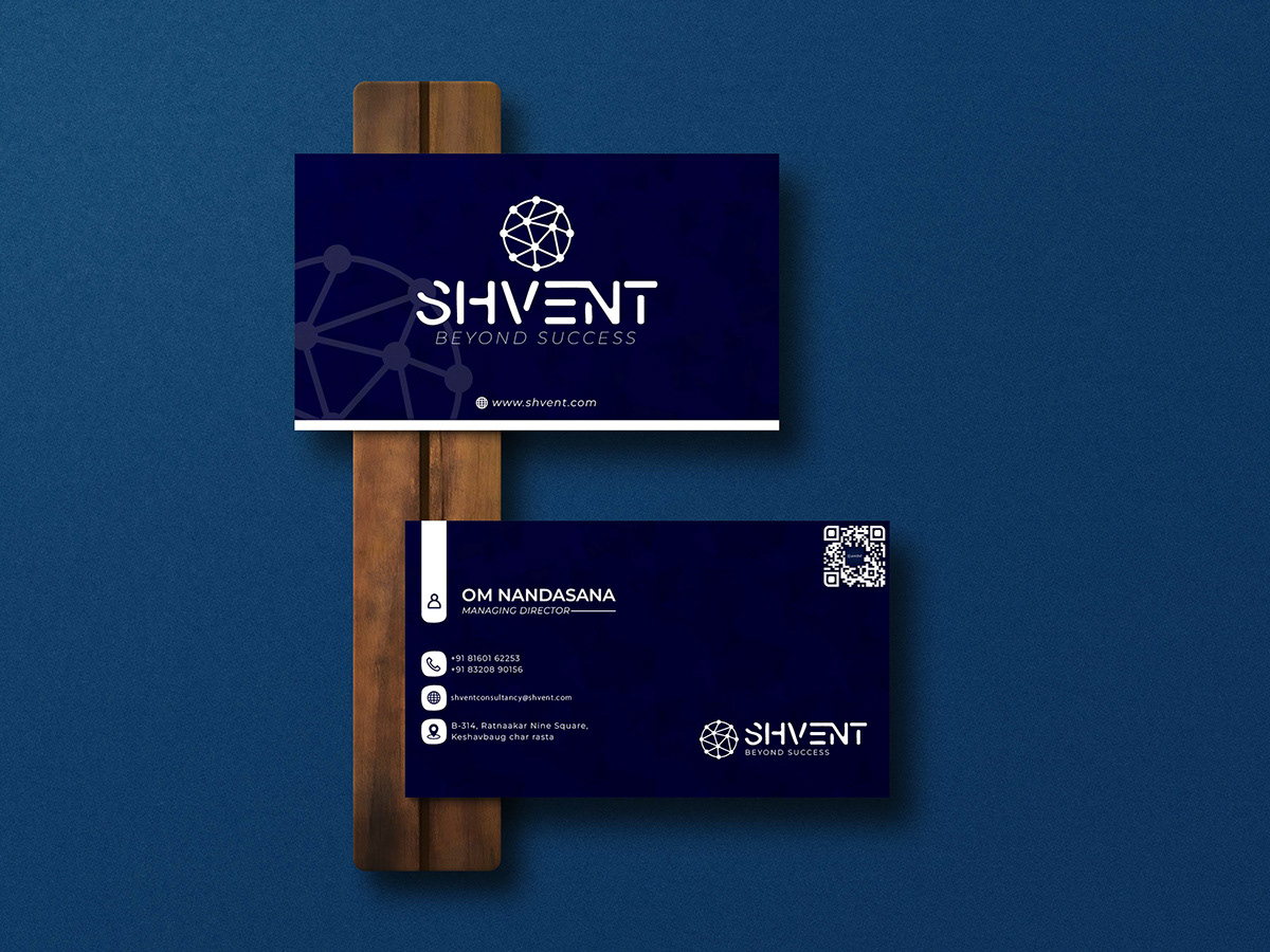
Ideation: Focused on a sleek, corporate identity with a strong visual hierarchy. Why it works: The clean layout communicates professionalism and trust.
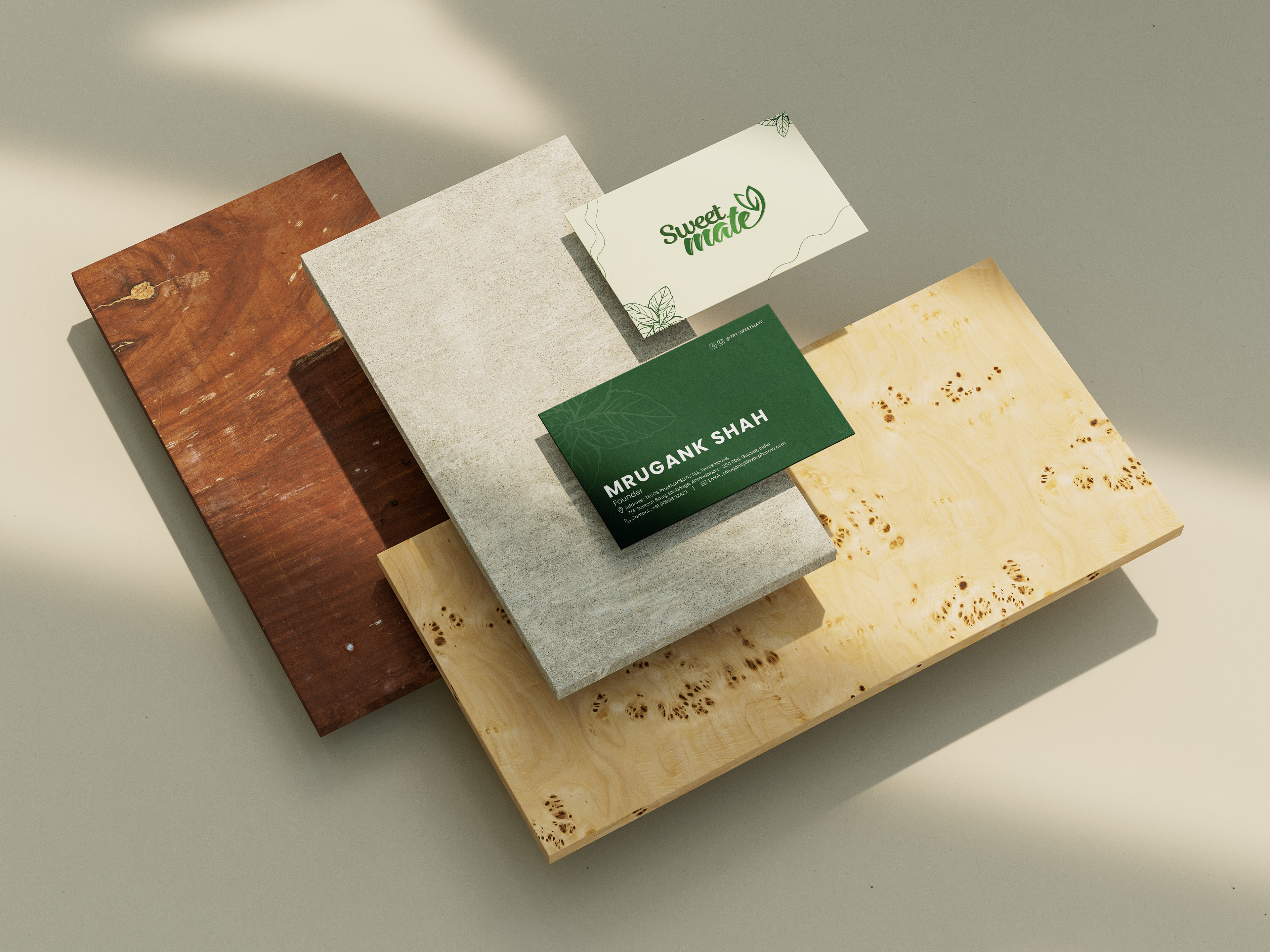
Ideation: Used soft tones and natural textures to reflect a warm, organic brand feel. Why it works: The aesthetic creates an emotional connection and enhances brand appeal.
Ideation: Highlighted each spice through its color and storytelling to celebrate Indian cuisine. Why it works: The vibrant visuals instantly attract attention and communicate richness.
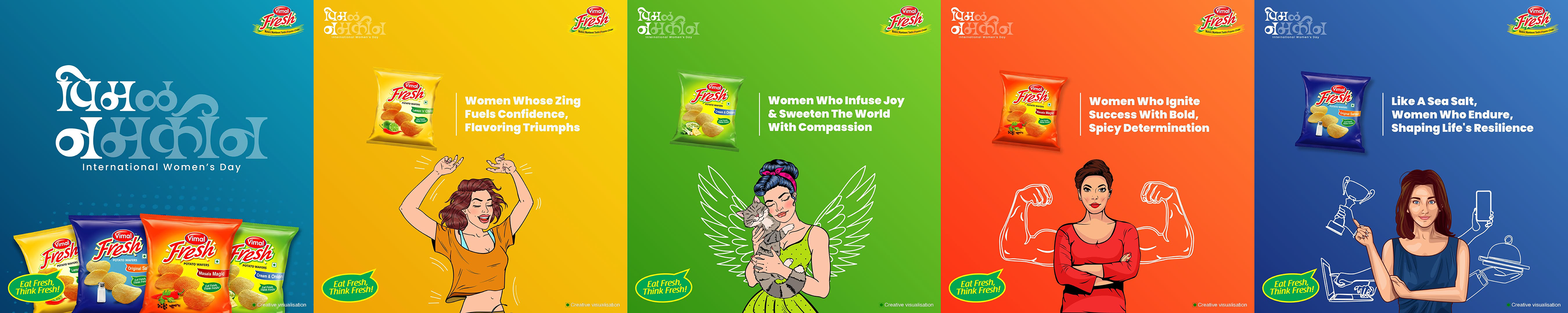
Ideation: Represented different personalities of women through bold illustrations and flavors. Why it works: The concept creates relatability while aligning product with empowerment.
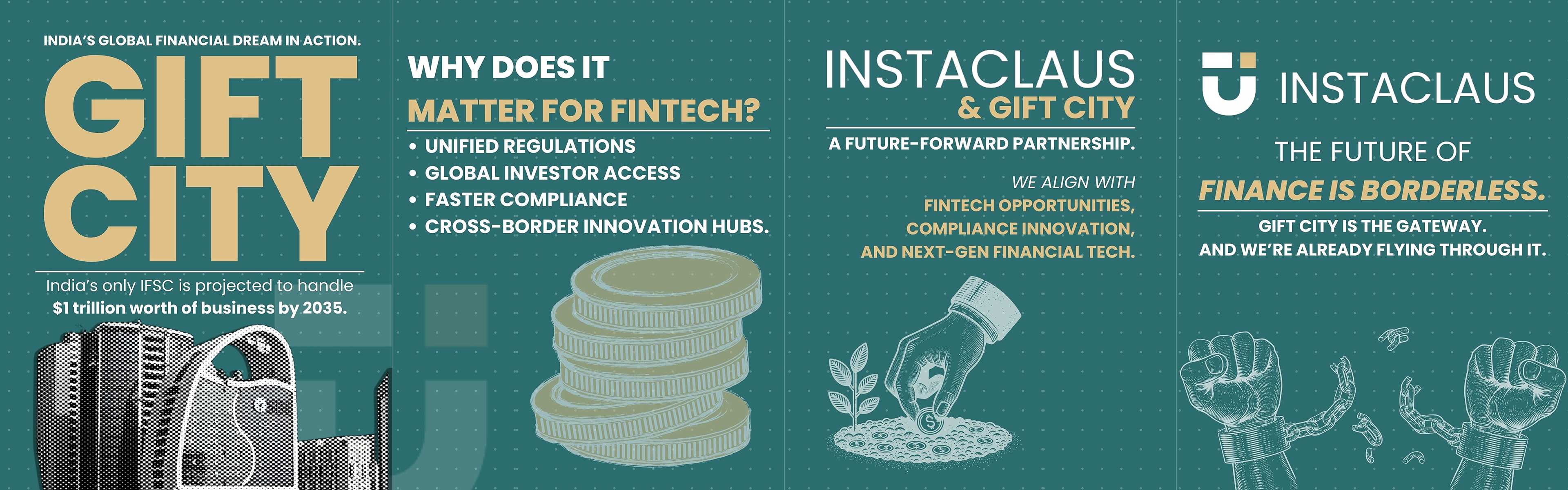
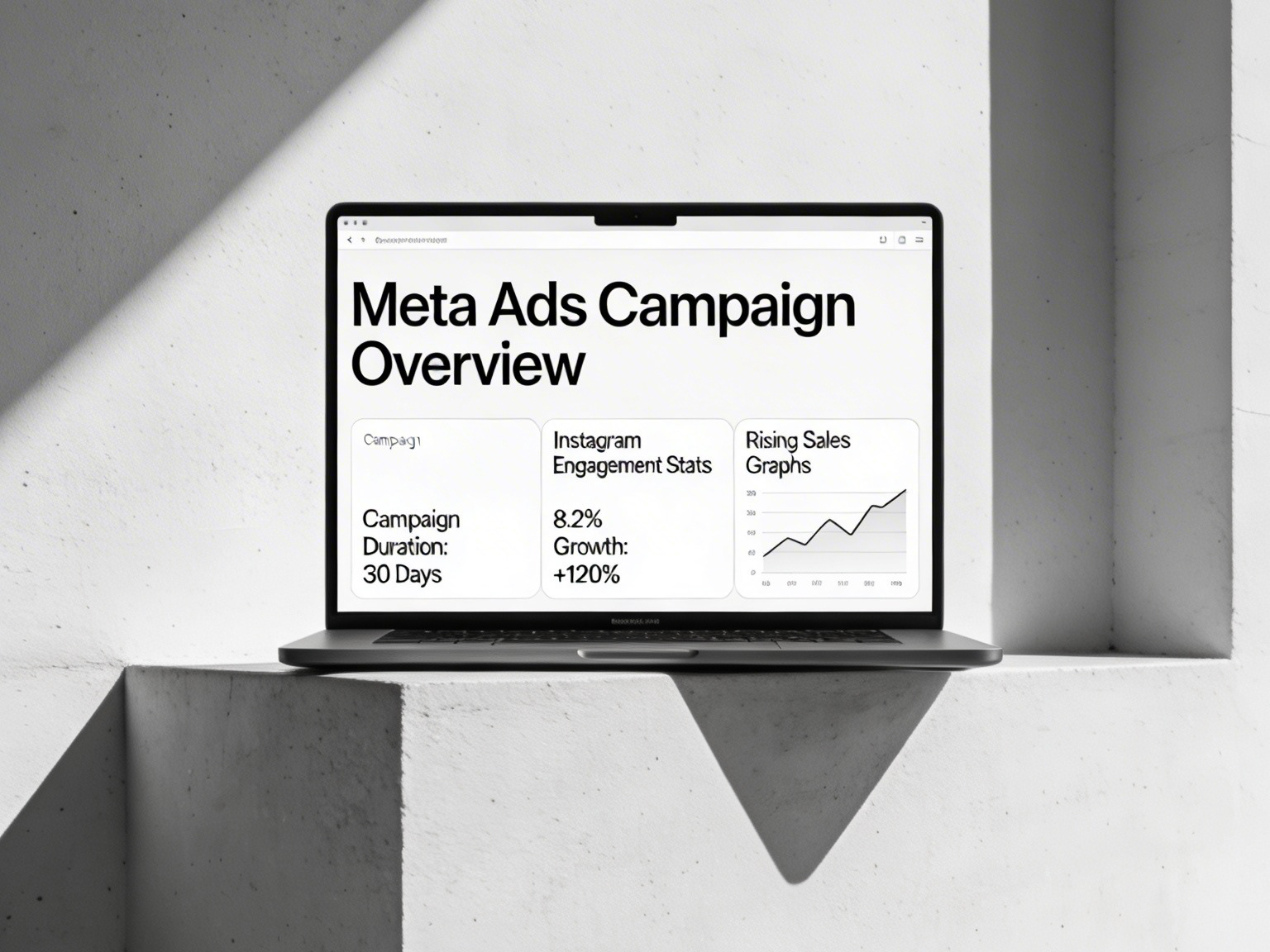
Ideation: Simplified complex fintech concepts into visually engaging and informative graphics. Why it works: The clarity and structure make the content easy to understand and engaging.
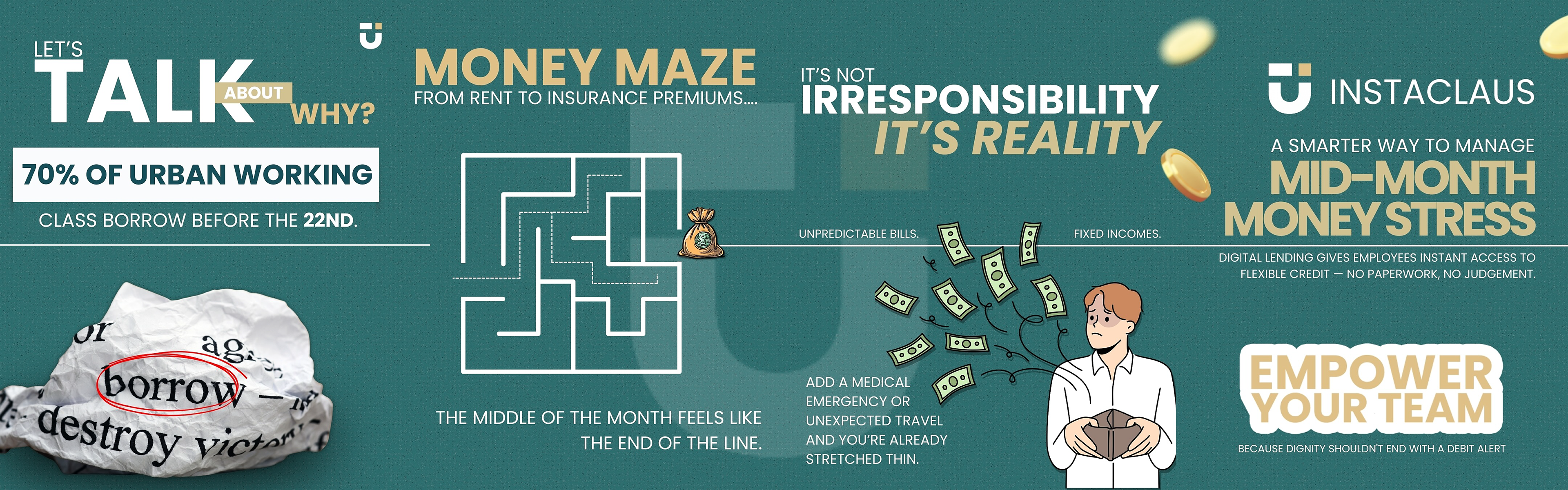
Ideation: Visualized mid-month financial stress through relatable scenarios and storytelling. Why it works: The emotional relatability makes the solution feel relevant and immediate.
Ideation: Explored abstract shapes to create a distinctive and memorable identity. Why it works: The unique form builds curiosity while maintaining strong visual recall.
Ideation: Focused on layering and attitude to highlight versatility in styling. Why it works: The bold poses and clean layout create a strong, confident fashion statement.
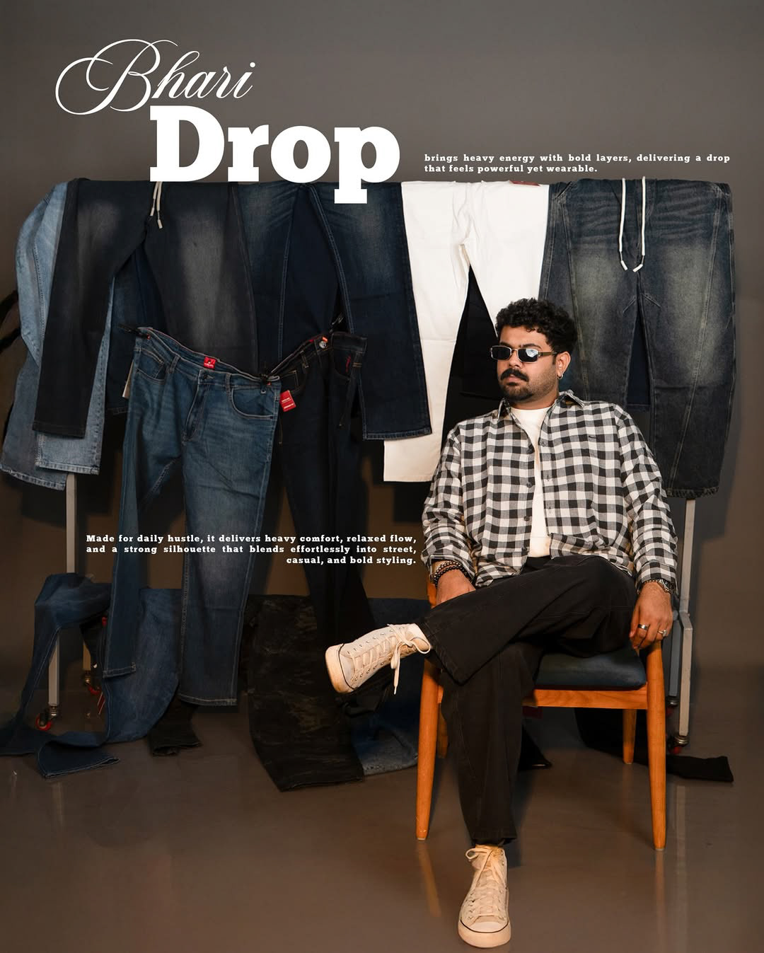
Ideation: Built around “heavy drop” culture, showcasing denim as bold and street-ready. Why it works: The rugged setup and stacked visuals emphasize strength and everyday wearability.
Ideation: Highlighted softness and luxury using pearls with minimal, refined composition. Why it works: The subtle lighting and clean typography elevate the product’s premium feel.
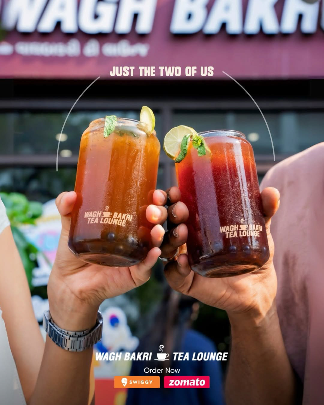
Ideation: Captured a casual “togetherness” moment to make the product feel social and refreshing. Why it works: The human element adds relatability, making the brand feel approachable.
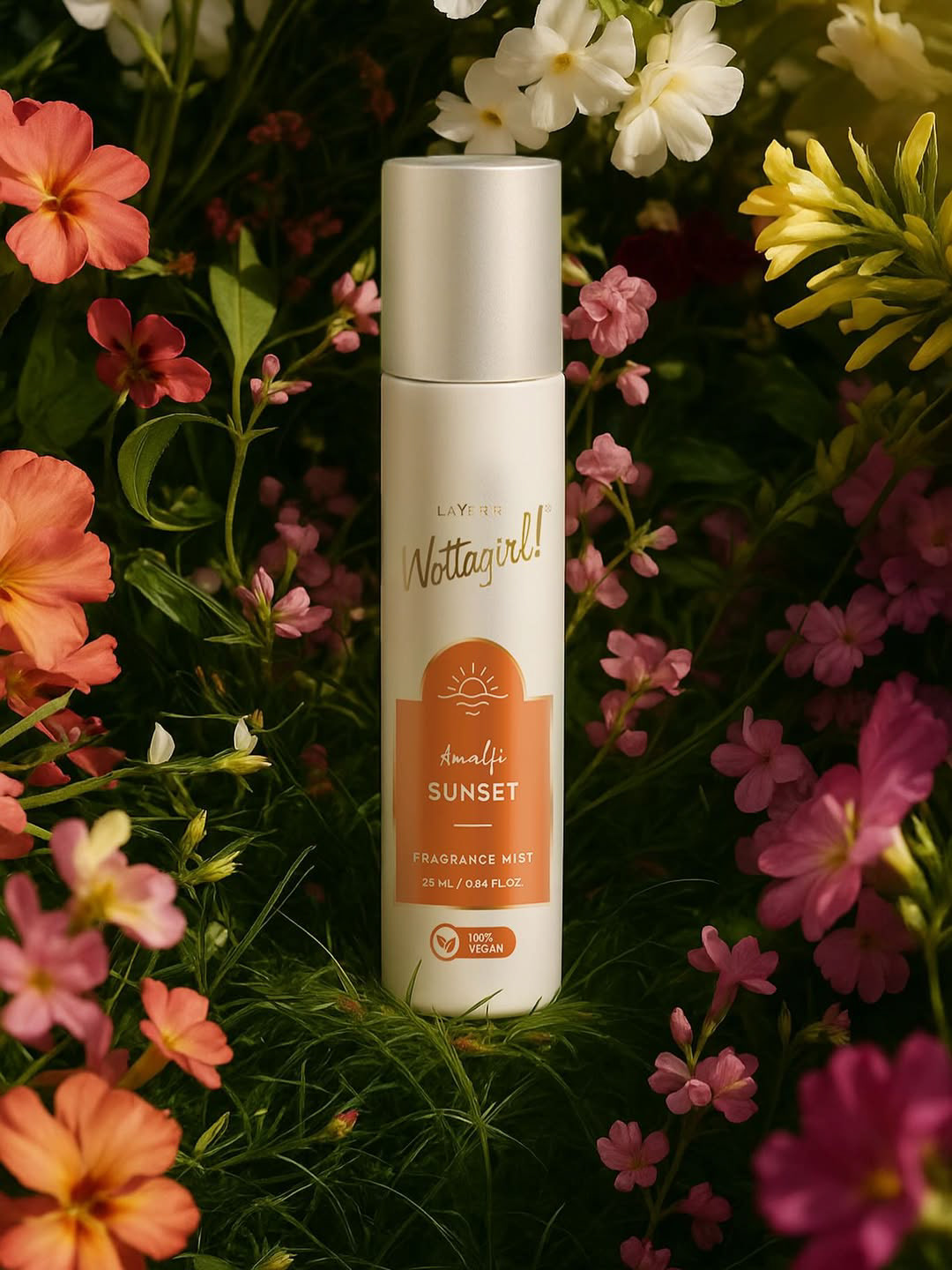
Ideation: Placed the product within flowers to reflect freshness and fragrance notes. Why it works: The natural setting visually communicates scent and enhances sensory appeal.
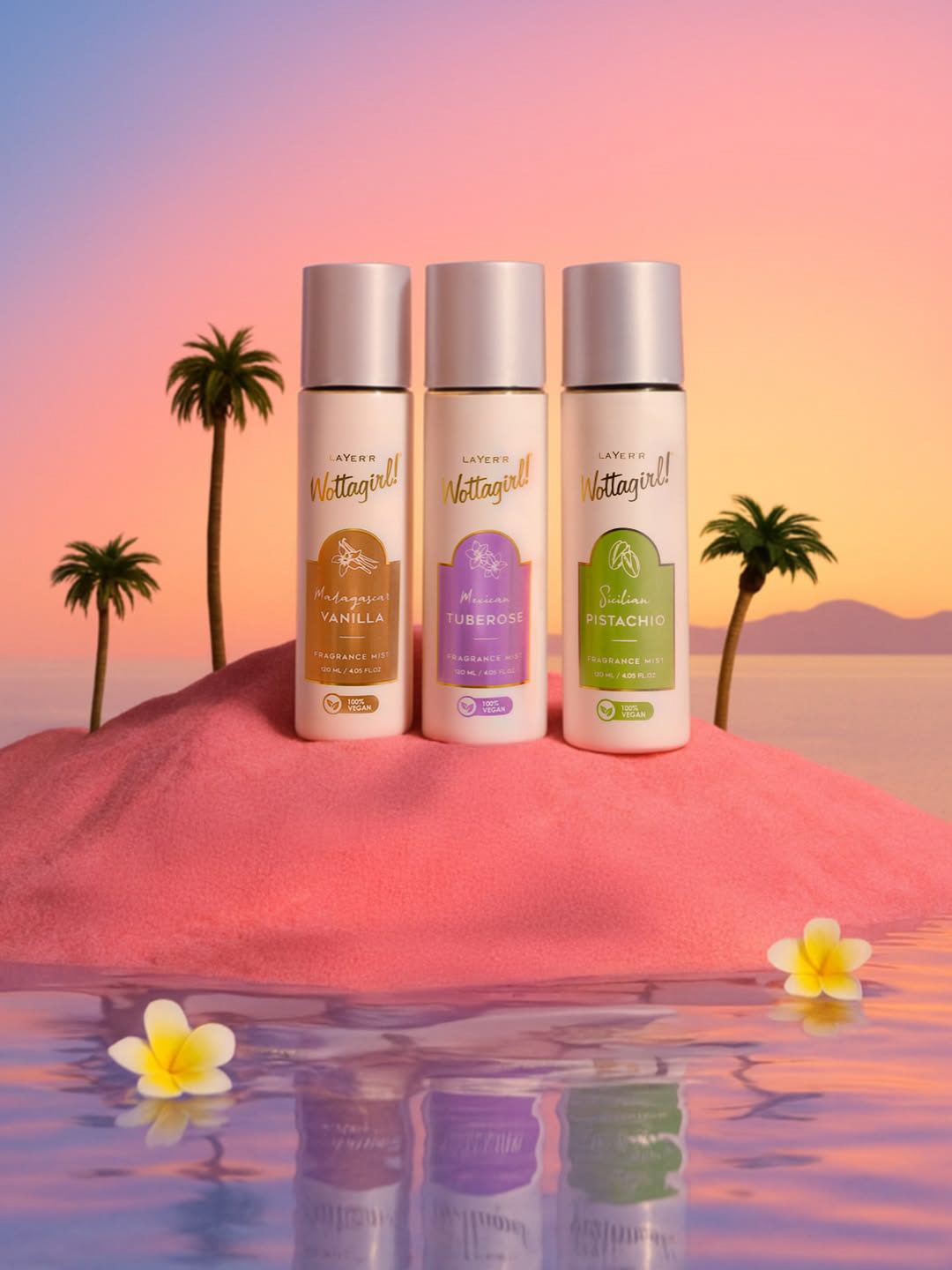
Ideation: Created a dreamy sunset environment to represent different fragrance moods. Why it works: The soft colors and surreal setting make the product feel aspirational and aesthetic.